Case Study 20

This case study was selected because of how the designer manages to make an attractive site even with very little information.
Look at this section — there are less than 100 words here, and only 4 hues of flat colour. Yet it is already pleasing to the eyes.

One reason why I think this design works is the use of lines as the motifs for the site. Notice how the icons are drawn using single, somewhat bold, lines? These lines are repeated in the small headings. (Even if there is no text in the heading!)

Another aspect of the site that I think help makes it look more refined is to let elements "cut over" into another one. This helps to reduce the single-dimension feel that would otherwise be very apparent.

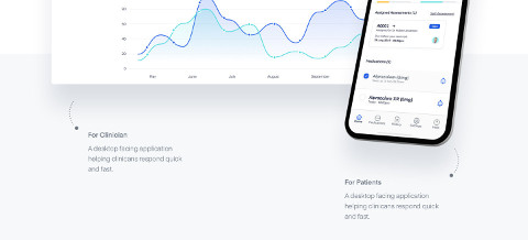
The graph and the phone mockups "overflows" into the next section. The touch of the dotted lines help to make the mockups feel more important as the main showcase piece rather than just simple mockups.
A few more techniques are employed to give more depth to the design:
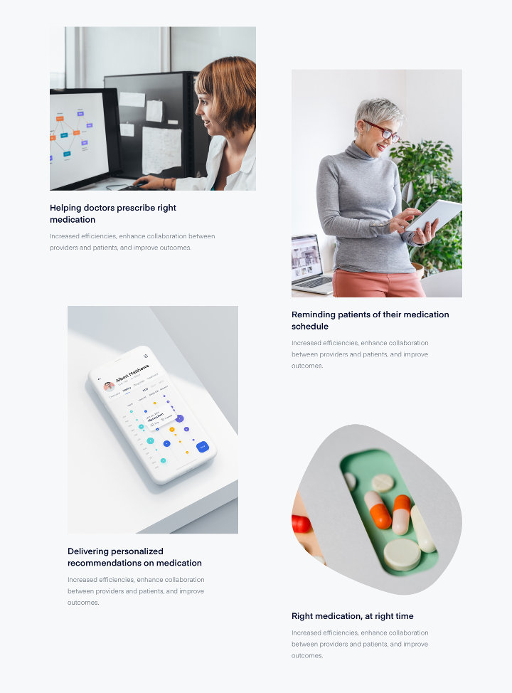
- Image grids that are not strictly aligned. (Figures 4A and 4B)
- Irregularly shaped photos. (Figures 5 and 4A)
